Analysis of the 2016 US General Election
Wed, 21 Oct 2020
Data Science, Data Visualization, Economics, Election, Voter Turnout, Voting
Counties within the United States vary substantially along a number of demographic and socioeconomic axes. These factors explain much of the variation observed throughout the US with respect to election and polling trends. This post attempts to untangle some of this complexity to give insight into the factors that influence voter behavior and other broader national trends.The Data
Data regarding U.S. counties and the 2016 U.S. election is obtained from opendatasoft. The dataset combines statistics on the thousands of state counties throughout the United States along with results for each of the 2016 general election candidates. By merging these two types of information, factors which contribute to the success or failure of specific candidates can be identified in addition to broader demographic trends.Distribution of Votes
The distribution of both the percent and count of votes for the two top candidates considered is shown in Figure 1. The histograms in the percent plot show that Trump won by larger margins on a county-by-county basis. The log-scale count plot reveals that Clinton won individual counties containing large counts of votes.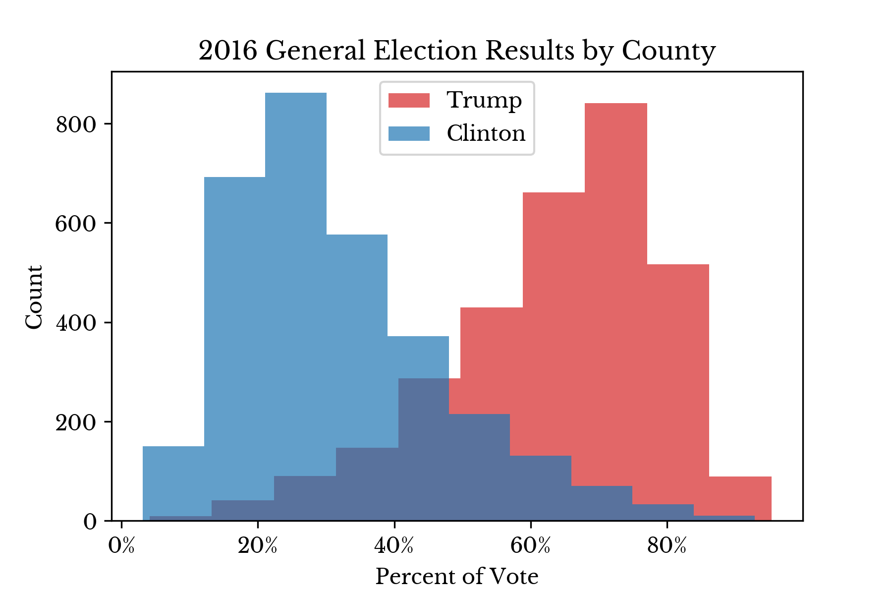 | 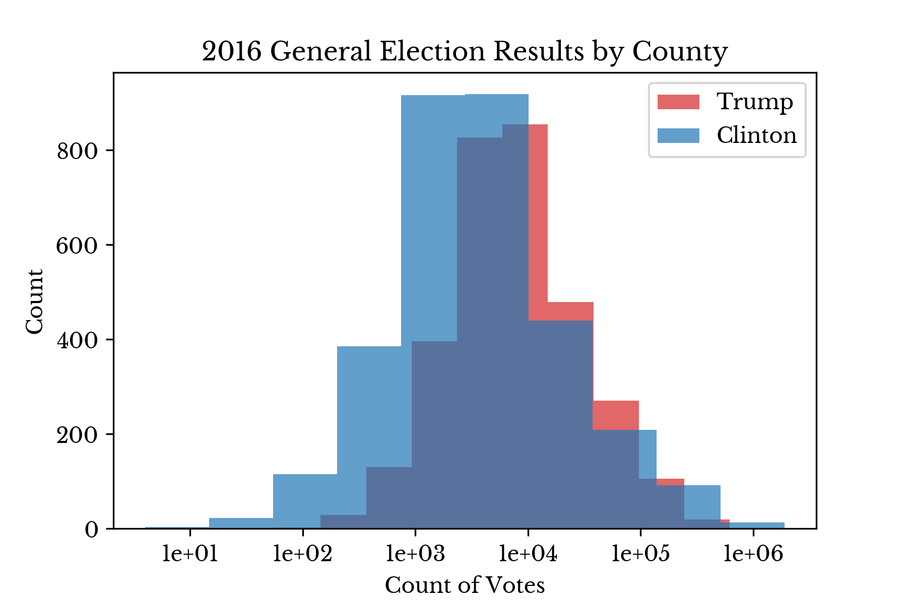 |
Figure 1: County Vote Distributions
Figure 2 plots log-population against candidate support and corroborates the above results, though the relationship between the two factors is somewhat tenuous.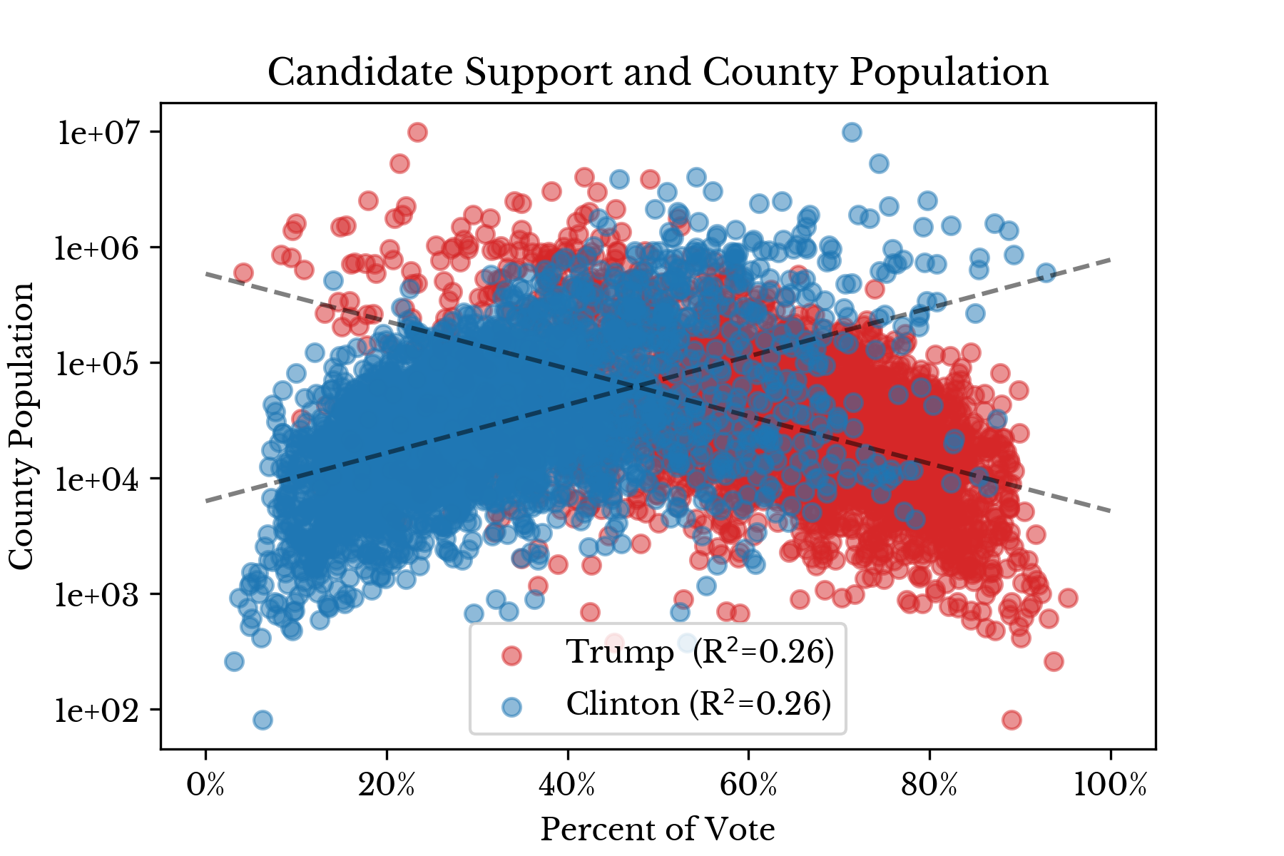
Figure 2: County Size and Candidate Support
Broadly speaking, the charts show that Trump has stronger support in lower population counties while the opposite is true for Clinton. These two plots help explain the fact that Clinton won the majority vote while Trump won the election.Voter Turnout
Next, a random forest model is used to identify leading factors that influence voter turnout. First, a regression model is constructed that estimates voter turnout for a county given statistics regarding the county. The top ten factors that contribute to voter turnout are shown as a bar chart in Figure 3.
Figure 3: Top Factors Influencing Voter Turnout
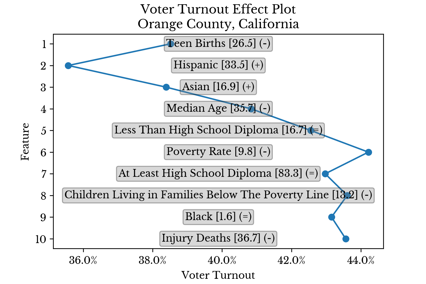
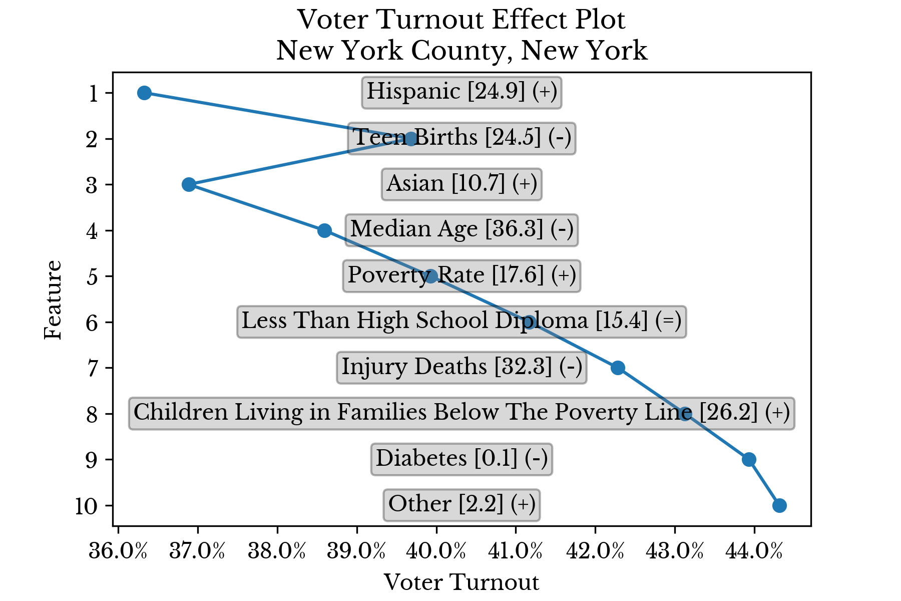
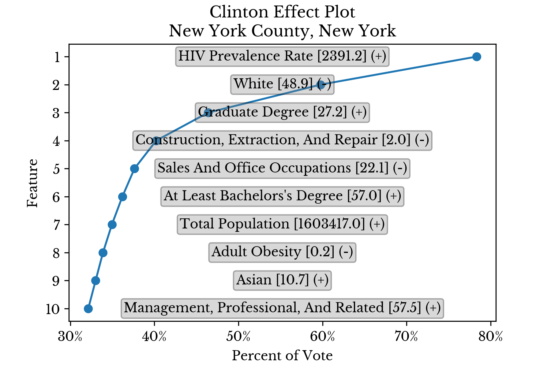
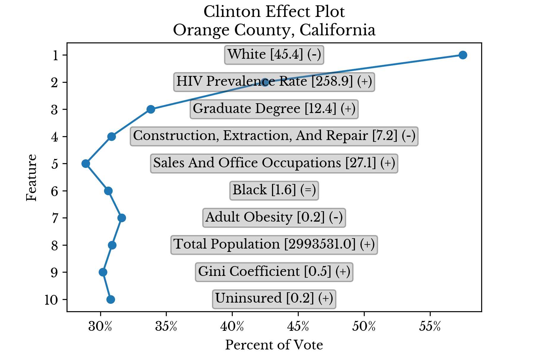
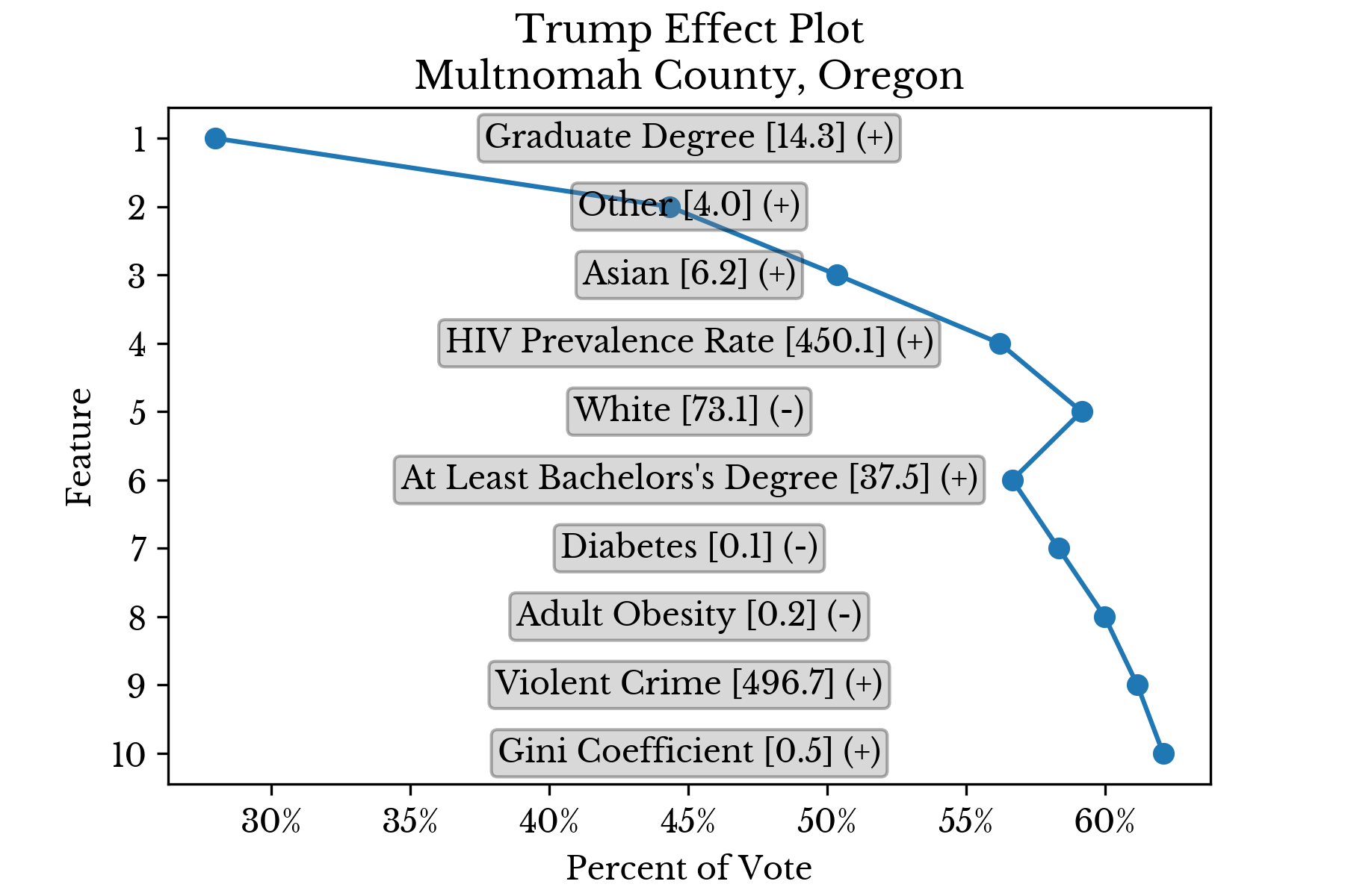
The x-axis represents the average amount each feature contributes to overall voter turnout in counties falling in the 55th percentile or higher of that feature. The color axis represents the average amount each feature contributes to overall voter turnout in counties at or below the 45th percentile. As can be seen, the most influential factor by a wide margin is median age.Next, the contributions of each feature are analyzed for specific counties to gain further insight into the behavior of the model. Figure 4 shows how the prediction of the model changes in light of evidence provided by each feature in turn.
 |  |
 |  |
Figure 4: Top Factors Influencing Voter Turnout in Select Counties
The features are sorted in descending order by the magnitude of their contribution. Further, the values are cumulative in that the partial prediction at a given rank contains all smaller predictions. In this way, the ultimate prediction is found at the top of the chart. The final symbol (+/=/-) denotes whether the feature value is relatively low, average, or high. This separation into three levels is made at the 40th and 60th percentiles.Candidate Support
Next, candidate support is analyzed in a similar fashion. Figure 5 shows the leading factors that influence support for Trump, Clinton, and 3rd party candidates. | 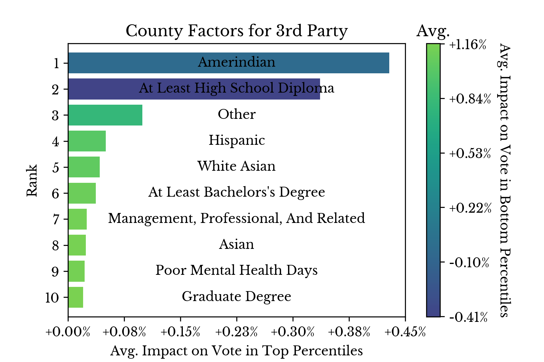 | 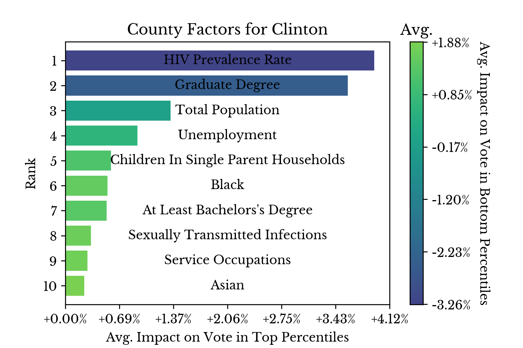 |
Figure 5: Top Factors Influencing Candidate Support
Again, the results for individual counties are displayed in separate charts to better understand the factors that influence candidate support.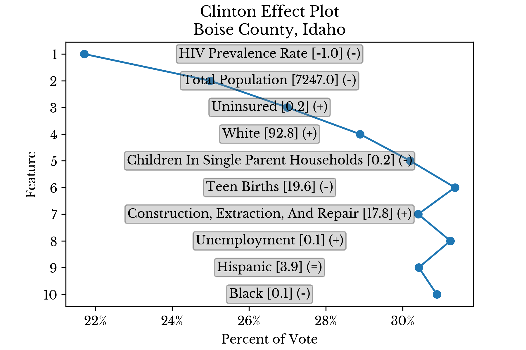 | 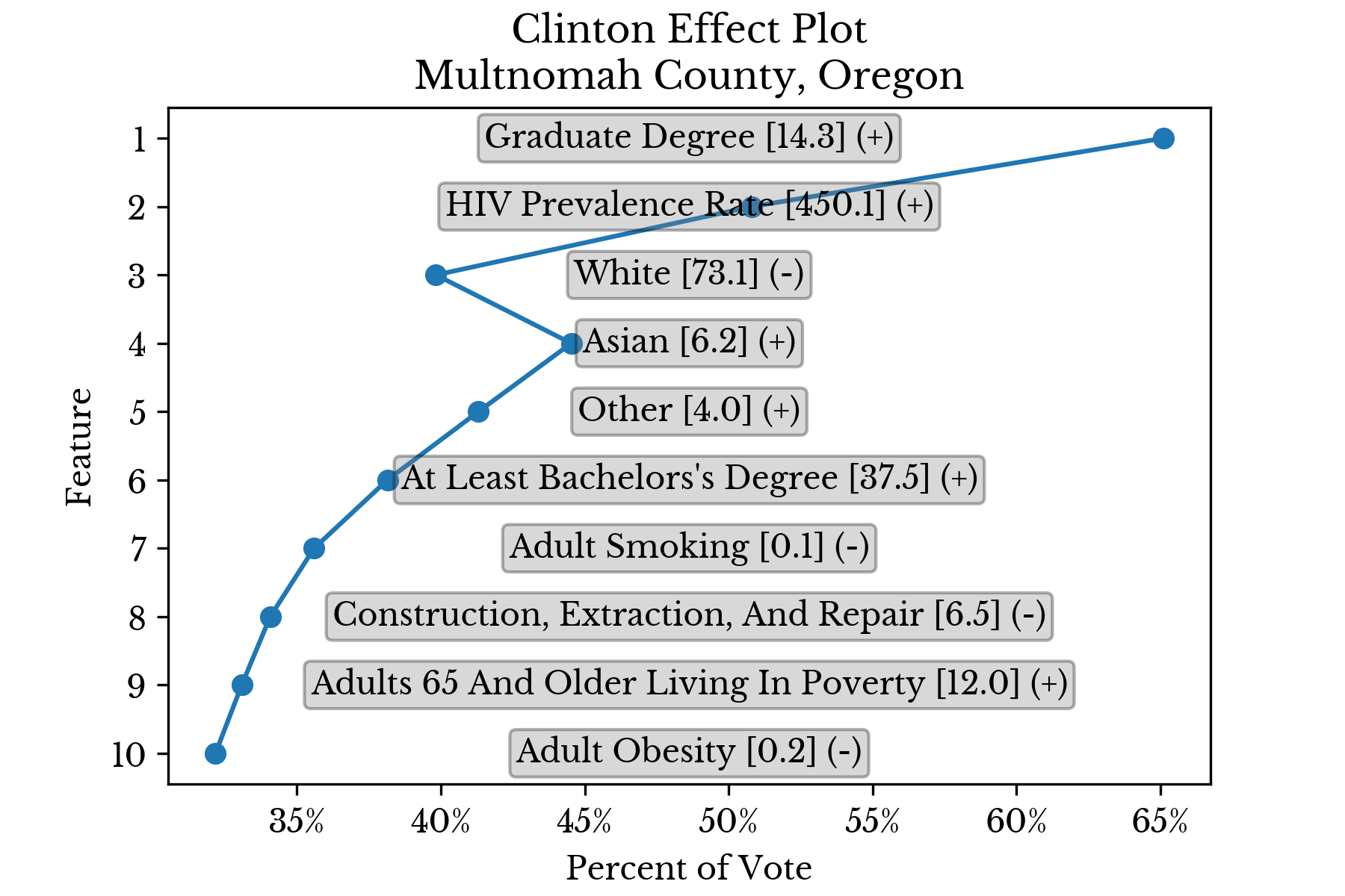 |
 |  |
 |  |
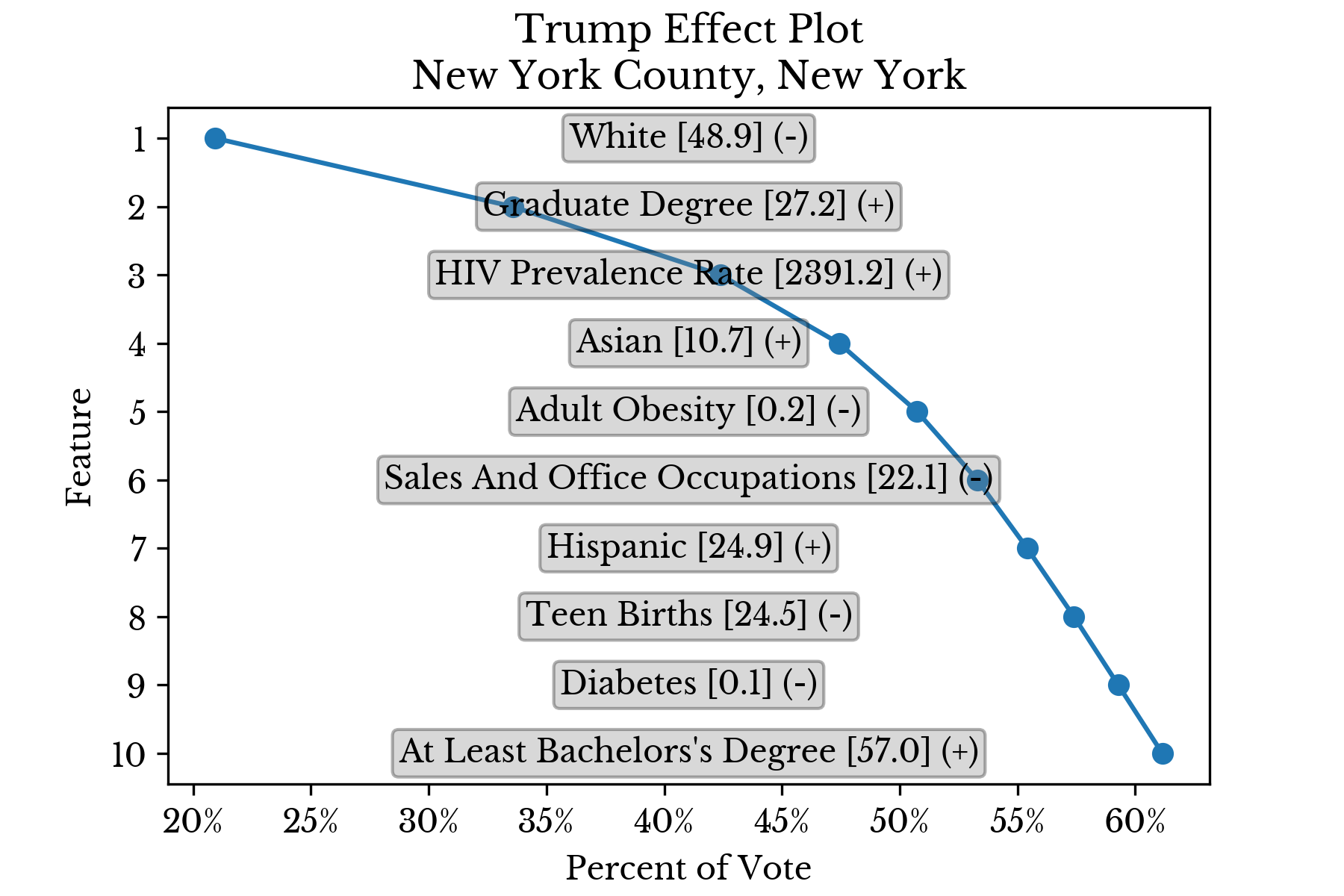 |  |
Figure 6: Top Factors Influencing Candidate Support in Select Counties
For instance, the model estimates that Trump has relatively less support in Orange County, California due in part to the relatively low and high proportions of white and asian residents in the county respectively. Education also appears to play a role with relatively high proportions of graduate and advanced degrees in the region.Socioeconomic Factors
Finally, multiple socioeconomic factors are considered simultaneously to view their relationships. The rate of diabetes, infant mortality, teen births, and violent crime are represented with a scatter chart using the x, y, color, and size axes respectively.
Figure 7: Socioeconomic Factors by County
As can be seen in Figure 7, there is significant correlation between the four factors. The strongest correlation is found between diabetes and infant mortality, which share a correlation of 0.61. The second most correlated pair are infant mortality and teenage births, which share a correlation of 0.55. Misfortunes never come alone, as the saying goes.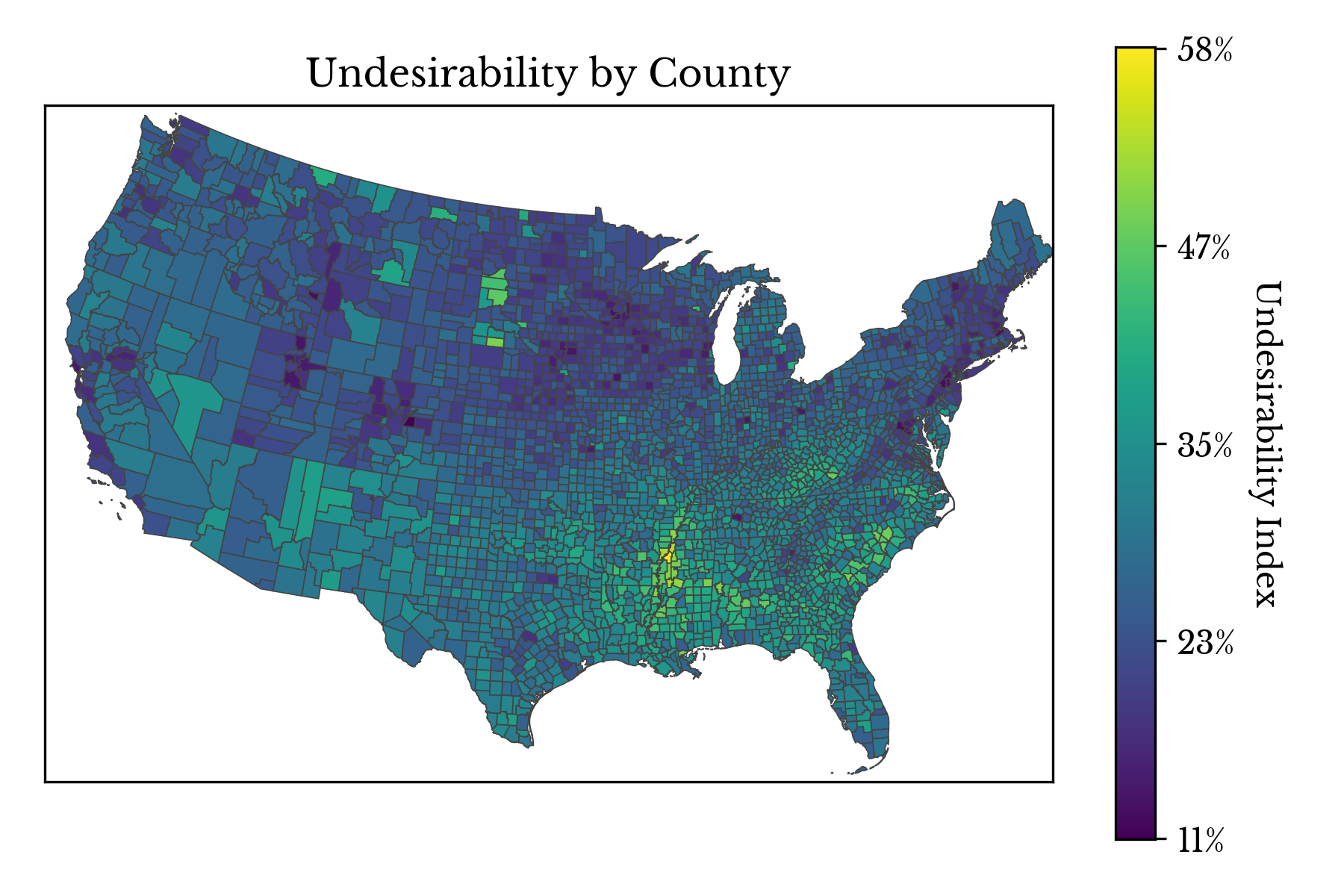
Figure 8: Undesirability by County
Finally, the negative socioeconomic factors are integrated into a single undesirability index. The index includes:- Poor Physical and Mental Health Days
- Low Birthweight Births
- Children in Single Parent Households
- Prevalence of Smoking Among Adults
- Prevalence of Obesity Among Adults
- Rate of Diabetes
- Number of Sexually Transmitted Infections
- Prevalence of HIV
- Percent Uninsured
- Percent Unemployed
- Violent Crime Rate
- Homicide Rate
- Number of Injury Deaths
- Infant Mortality Rate