Population Normalized CoVID-19 Charts and Predictions
Sun, 22 Mar 2020
Coronavirus, Covid-19, Data Science, Data Visualization, Medicine
The following charts compare the number of deaths resulting from the CoVID-19 pandemic in various countries as of March 20th 2020. The daily totals are normalized by the population in each country to produce per capita numbers. Per capita numbers allow for more easy comparison between countries.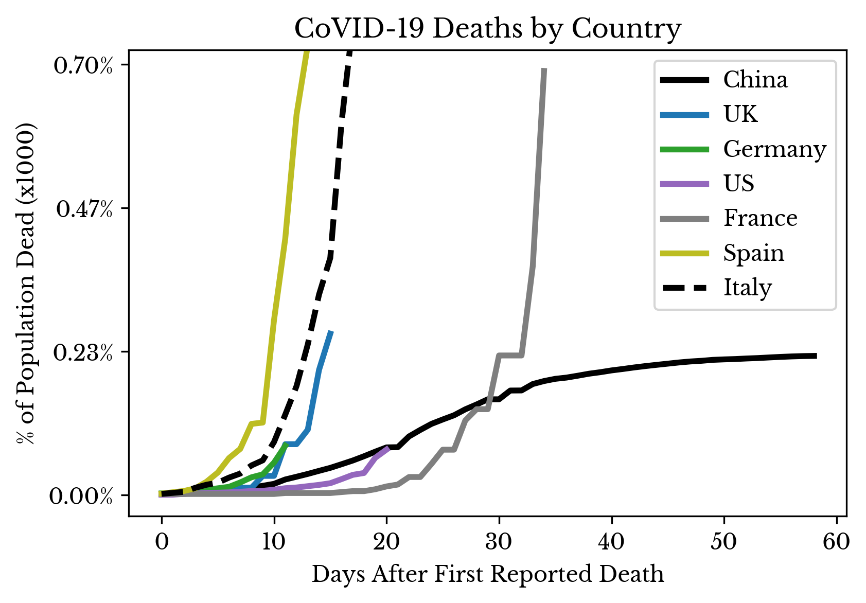 | 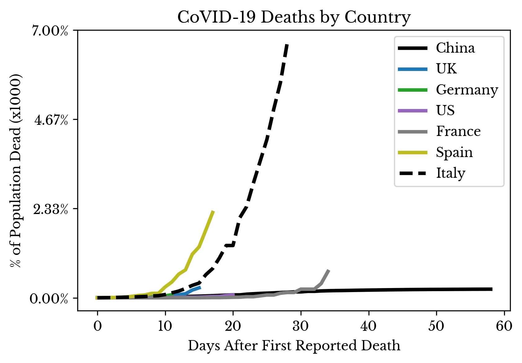 |
Figure 1: CoVID-19 Deaths by Country
The curves are aligned by the date of the first reported death in each country, allowing for more ready comparison of the growth rates.
 |  |
 |  |
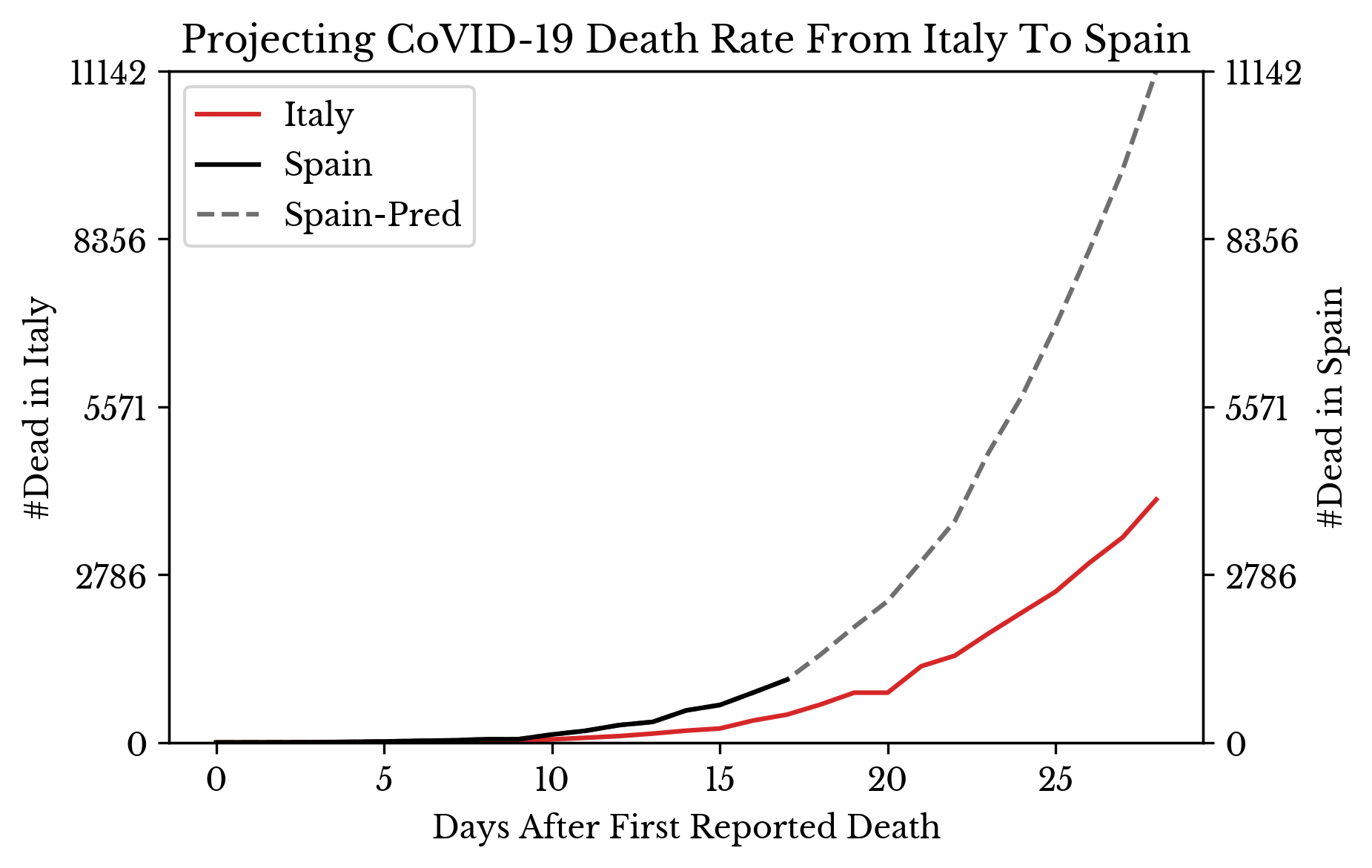 | 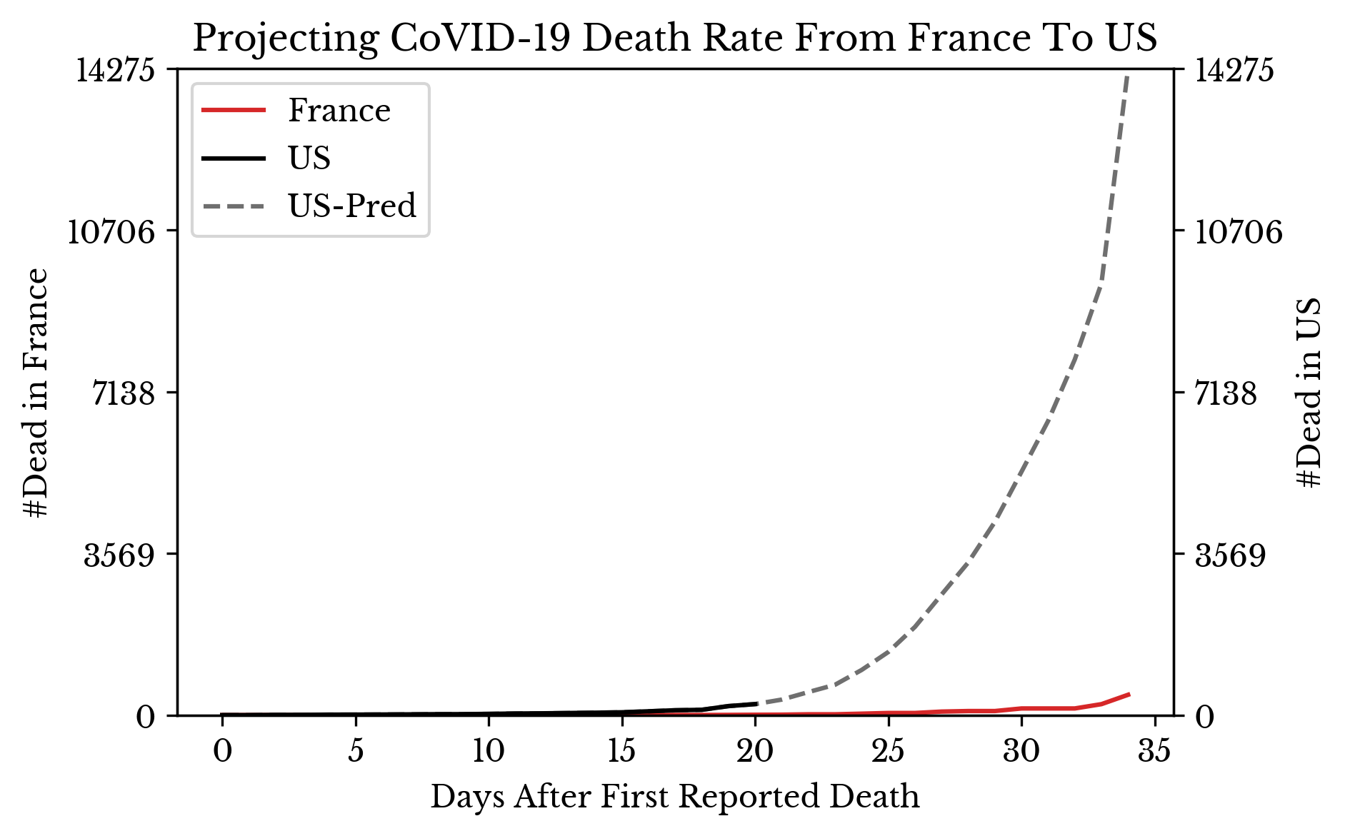 |
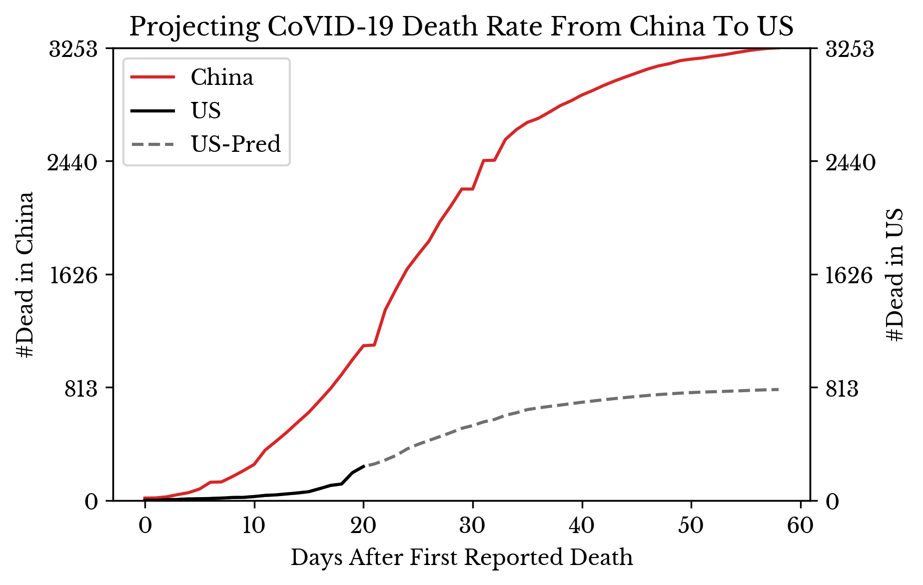
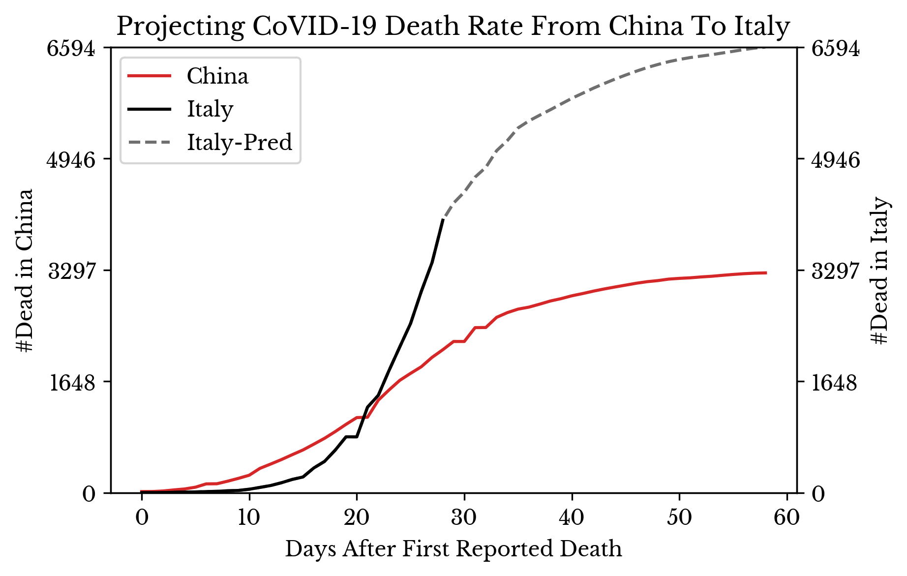
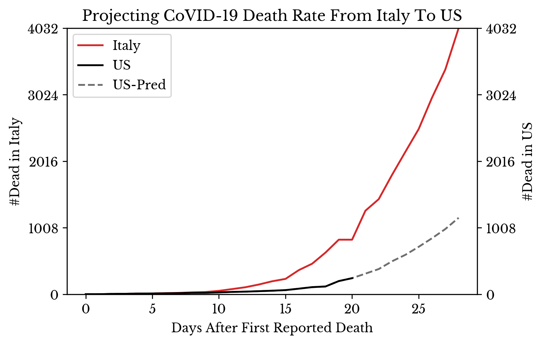
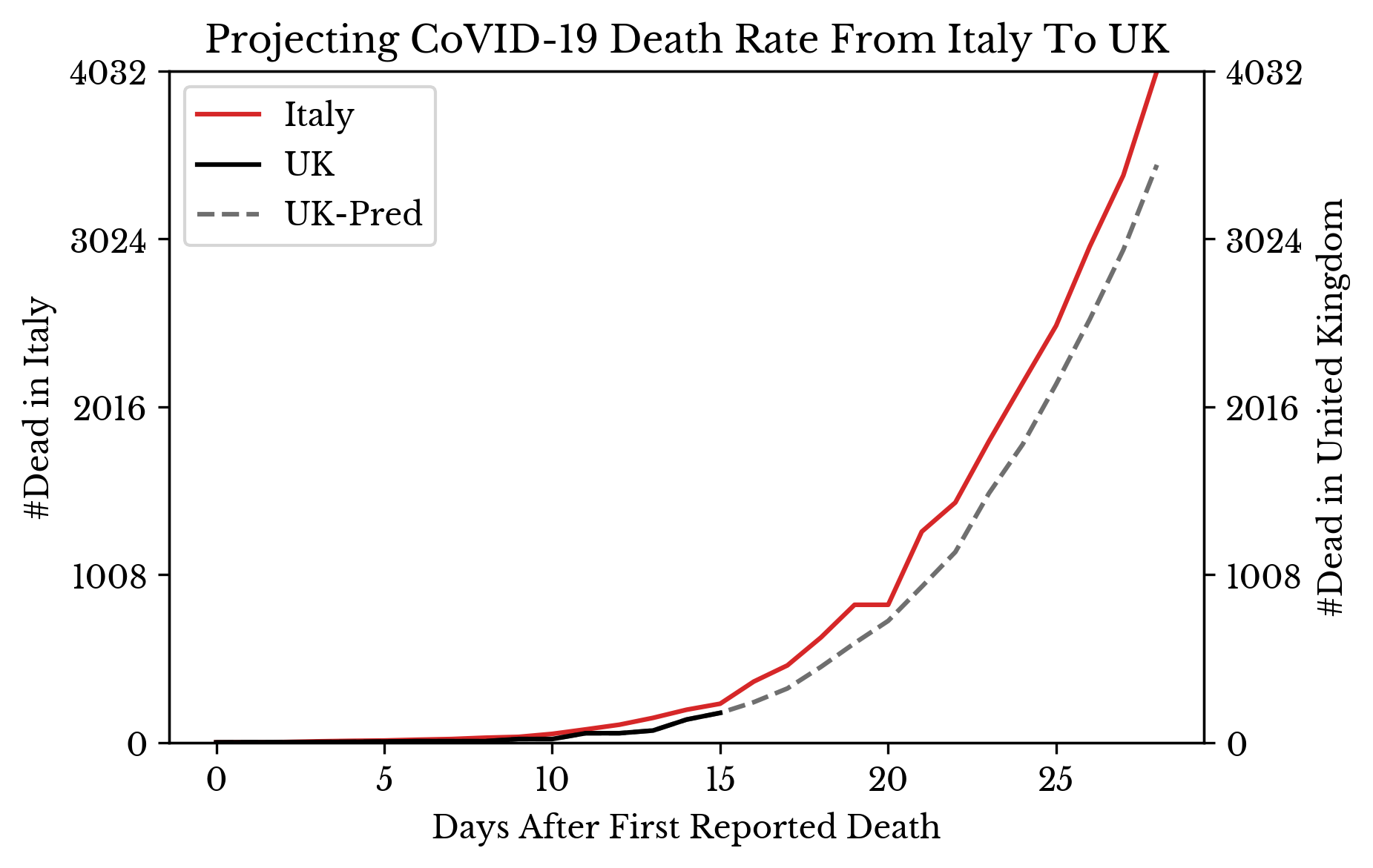
Figure 2: Projection of CoVID-19 Deaths
In Figure 2, the smoothed daily growth rates from one country are projected onto the numbers of another country to predict forward in time. By comparing different growth rates for the same country, a range of potential outcomes for the country is produced.