A Brief Analysis of Survey Data from a Speed Dating Event
Sat, 05 May 2018
Data Science, Data Visualization, Human Behavior, Statistics
In this post, survey data collected from several speed dating events is analyzed. The events were conducted between 2002 and 2004 by two professors from Columbia University: Ray Fisman and Sheena Iyengar. In addition to questions about personal interests, the survey includes academic and occupational questions as well.The survey results are contained in a CSV file. Each row in the data set represents a pairing of two partners during the event. The rows contains information about both individuals as well as several computed interaction values.
Analysis by Field
First, the data is grouped by field of study and averaged. A chord chart is constructed showing the number of matches between different fields of study.

Figure 1: Matches Between Fields of Study
Next, the averaged data is shown in a column and line chart. The columns display the average ratio of partners expressing interest to total partners for each field. The line represents the number of participants in each field.

Figure 2: Average Interest and Count by Field
The majority of participants are within the Business/Economics/Finance column. Participants from languages and medical match with the largest ratio of their partners. However, the sample size from these fields is quite small. Since there is only one participant in each of the architecture and undecided columns, these fields are filtered in later graphs.
With a ratio of 0.31, engineers match with the smallest ratio of their partners. To formally compare the difference between business and engineering, a Welch's t-test for the difference of two means is conducted. The difference between these two fields is found to be significant (p < 1e-11).
In the event, participants are asked to rate their interest on a scale from 1 to 10 in several areas. These areas include art, music, gaming, hiking, and others. By grouping participants by field, average interest in these areas per field is explored.
The data for each field is aggregated and the average interest per field is computed. Figure 3 shows a scatter plot of interest in gaming, movies, and music by field. Larger plot markers indicate more interest in music.
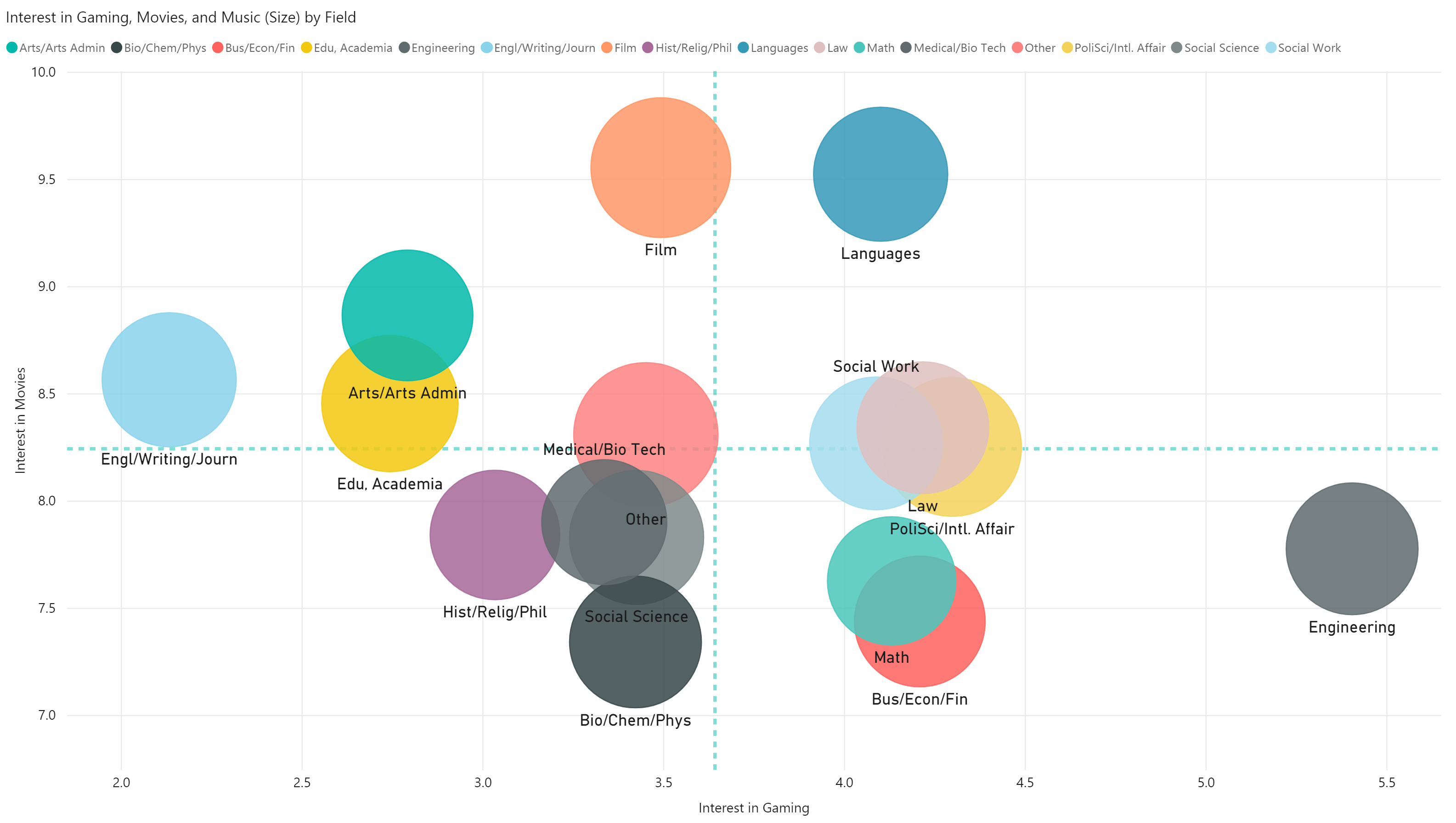
Figure 3: Average Interest in Gaming, Movies, and Music
Engineers have above average interest in gaming and below average interest in movies. The opposite is true for English, creative writing, or journalism majors. Scatter plots are also constructed for interest in yoga, clubbing, and hiking as well as shopping, museums, and theater.
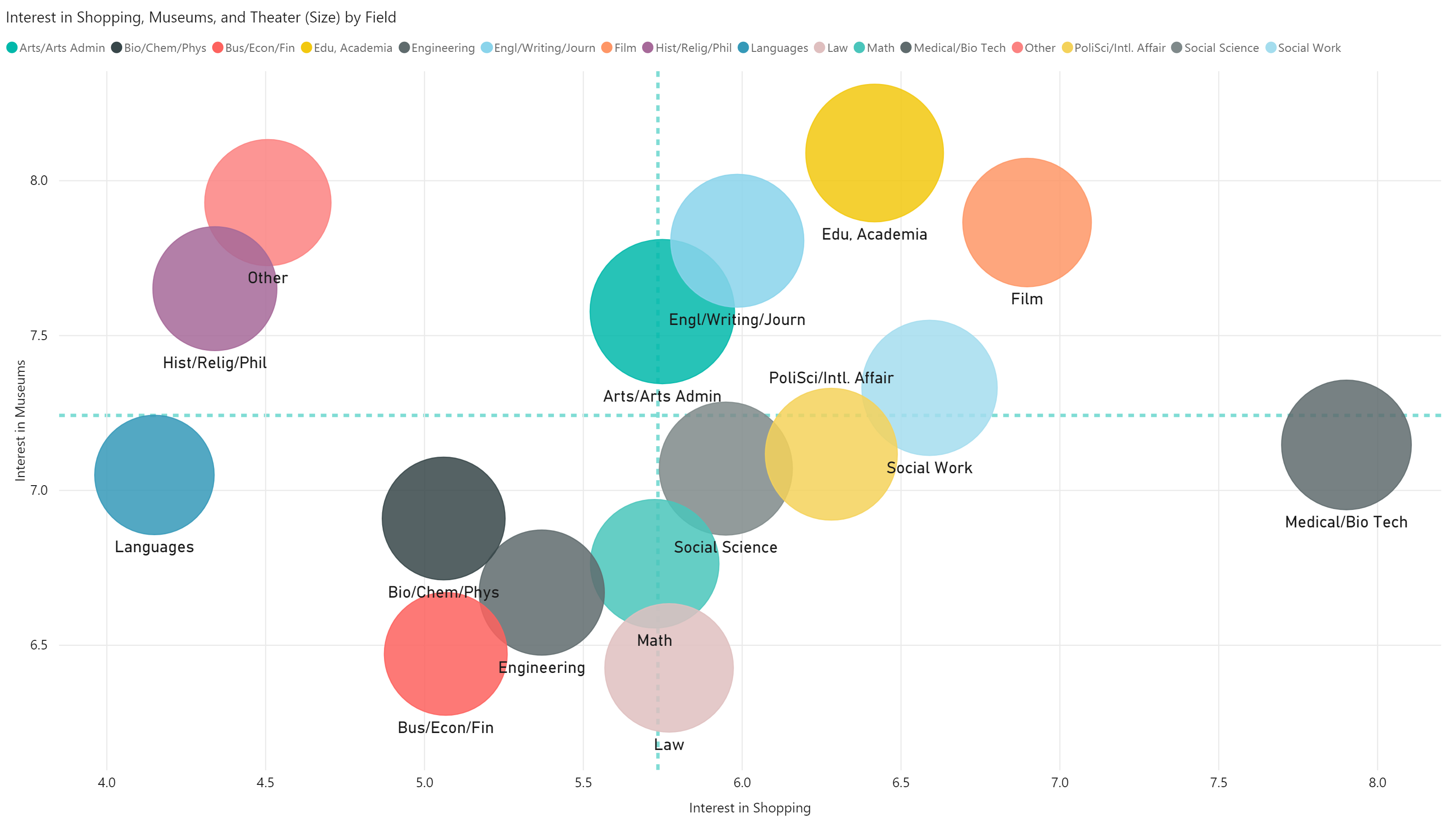


Figure 4: Average Interest in Other Areas
The results appear mostly in line with intuition. There are two clusters of fields that are divided over interest in yoga. The group on the left includes medicine, law, math, and the sciences. The group on the left includes the humanities, social science, and languages. The group on the left is significantly less interested in yoga than the one on the right.

Figure 5: Importance of Race and Religion
The survey asks participants to rate the importance of religion and race in finding a match. The scale ranges from 1 to 7 with 7 indicating the highest importance. Another scatter plot is constructed from the results of these questions. The result is shown in Figure 5.
Gender Differences
The participants are divided by gender and interest in gaming. The results are displayed in a column chart along with the ratio of partners matched.

Figure 6: Participants by Interest in Gaming
The more central values of interest elicit similar responses. The extreme values tend to elicit stronger positive or negative responses. The single largest group of women indicate the least amount of interest in gaming.
Next, average interest in all areas is computed for each gender and the result is displayed in a clustered column chart.

Figure 7: Average Interest by Gender
Movies, music, and dining are rated the highest with yoga and gaming rated the lowest. It is likely that participation bias is influencing these results somewhat. Movies, music, and dining are classic dating activities and interest in them is likely higher in those who participate in speed dating events than in the general population.
Next, the gender balance in each field of study is explored. A chord diagram is constructed which shows the gender balance in different fields of study. The top three fields for men are business, engineering, and the natural sciences. The top three fields for women are social science, education/academia, and the natural sciences.

Figure 8: Gender Counts by Field of Study
Men comprise the majority in business, engineering, and law. Women make up a majority in social science, education/academia, English, and several of the other less populous fields. The distribution of men is more imbalanced; the majority of men reside within a minority of the fields. The distribution of women is more balanced.
Analysis by Career
Next, a scatter plot is constructed that plots the ratio of partners expressing interest to the ratio of participants expressing interest. The size represents the average number of matches for each field (a match occurs when both partners are interested).
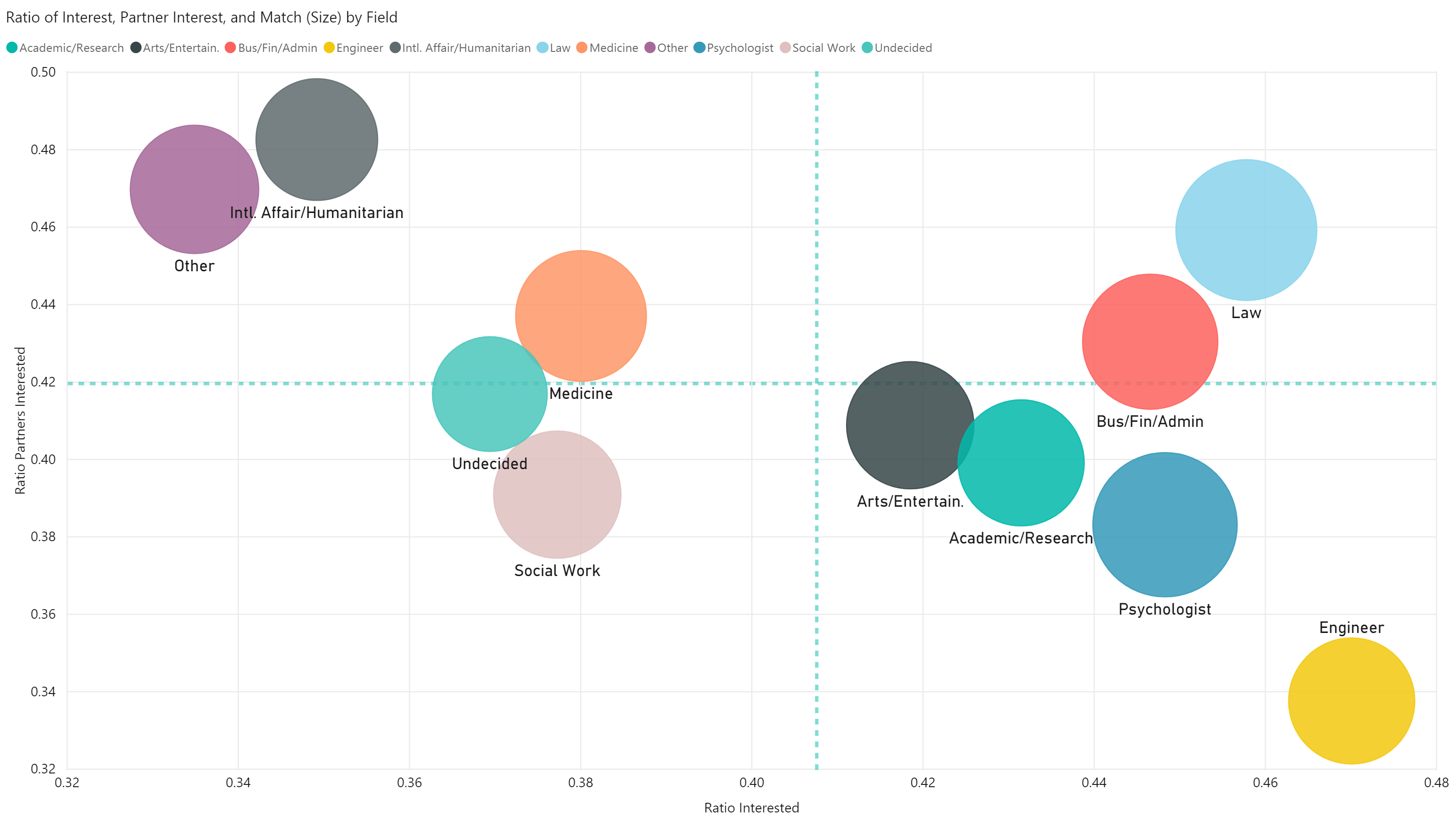
Figure 9: Match Decisions by Career
Engineers are interested in the largest number of partners but elicit the least amount of interest. The converse is true for those in the field of international affairs and humanitarian causes.
Next, a Sankey diagram is constructed showing the relationship between field of study and career. The nodes on the left represent field of study and those on the right indicate career.

Figure 10: Field of Study to Current Career
Most of the results make sense, though there are some interesting points. For instance, more engineers desire careers in business, finance, and academia than actual engineering jobs. This result is most likely affected by participation bias as well.
Analysis by Age Group
Next, the participants are grouped into bins by age. A scatter plot is constructed plotting average interest in theater against average interest in gaming for each age group.

Figure 11: Interest in Theater and Gaming by Age Group
Older participants are less interested in gaming but only slightly more interested in theater. The plot marker size indicates the number of participants in each age group.
The dataset contains many other interesting features. Unfortunately, a large number of these features have a large amount of missing values.
The charts in this post were made using Microsoft PowerBI.